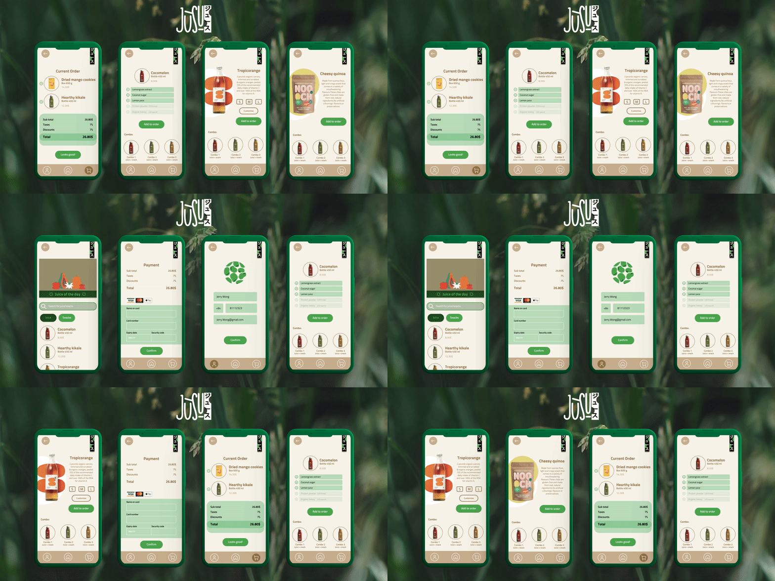
Project background:
As part of the Google UX design course, I undertook an assignment that involved conducting research and developing an order and payment application for a restaurant named "Jùsu". Jùsu is a Japanese-style eatery specializing in healthy juices and snacks, with a strong emphasis on promoting body detoxification and fostering a healthy lifestyle.
The problem:
Busy workers and students lack the time necessary to exercise and maintain a healthy lifestyle
The goal:
Design an app for Jùsu that allows users to easily order healthy juices and snacks
My role:
UX designer designing an app for Jùsu from conception to delivery.
Responsibilities:
Conducting interviews, paper and digital wireframing, low and high-fidelity prototyping, conducting usability studies, accounting for accessibility, and iterating on designs.
Understanding:
User research
Personas
Problem statements
User journey maps
I conducted interviews and created empathy maps to understand the users I’m
designing for and their needs. A primary user group identified through research
was working adults and students who trying to live a healthier lifestyle.
This user group confirmed initial assumptions about Jùsu customers, but research
also revealed that time was not the only factor limiting users from preparing healthy juices/snacks.
Other user problems included obligations, interests, or challenges that make it
difficult to get groceries for cooking or go to restaurants in-person.
User research: summary
User research pain points
Persona: Jerry
Persona: Annie
User journey map
Goal: Find an easy, straightforward app for healthy drinks and snacks
Mapping Jerry’s user journey revealed how helpful it would be for
users to have access to a dedicated Jùsu's app.
Starting the Design:
Paper wireframes
Digital wireframes
Low-fidelity prototype
Usability studies
As the initial design phase continued, I made sure to base screen designs on feedback and findings from the user research.
Easy navigation was a key user need to address in the designs in addition to equipping the app to work with assistive technologies.
Digital wireframes
Using the completed set of digital wireframes, I created a low-fidelity prototype. The primary user flow I connected was building and ordering juice/snack, so the prototype could be used in a usability study.
Low-fidelity prototype
Usability study:
Study details
Themes
Insights & Recommendations
Study Details
Research Questions
How long does it take for a user to select and order juices/snack in the app?
Are users able to successfully order the juices/snacks that they want?
What can we learn from the steps users took to order juices/snacks?
Are there any parts of the ordering process where users are getting stuck?
Is the payment process easy for the customer?
Participants
5 participants
Participants between the ages of 16-60 who reside in metropolitan and suburb areas. Participants order out at least once a week.
Methodology
20-25 minutes
United States, remote
Users were asked to order juices/snacks on a low-fidelity prototype
Research insights
Supporting evidence from the usability study.
4 out of 5 total participants said they were not able to confirm their profile
4 out of 5 total participants expressed a desire to have a save button
"how am i supposed to save this? is this automatic?"— Participant B
People want to create profile
People want to add in date option for delivery schedule
Supporting evidence from the usability study.
2 out of 5 total participants said they were not able to find the date schedule
"So this doesn't show a date? just time? is it just for 1 day so u can't schedule in advance?"— Participant D
Supporting evidence from the usability study.
1 out of 5 total participants said they were not able to find the customisation button
1 out of 5 total participants said they were not able to add in extra ingredient
"I can take some of the ingredients out of my drink but can't add other things in? what if i want extra shot of something?"— Participant A
“Maybe make it easier to use for older people since the texts are very small”— Participant D
People want to re-design customisation part
RefiningDesign
Mockups
High-fidelity prototype
Accessibility
The final high-fidelity prototype presented cleaner user flows for buying juice or snacks and checkout.


